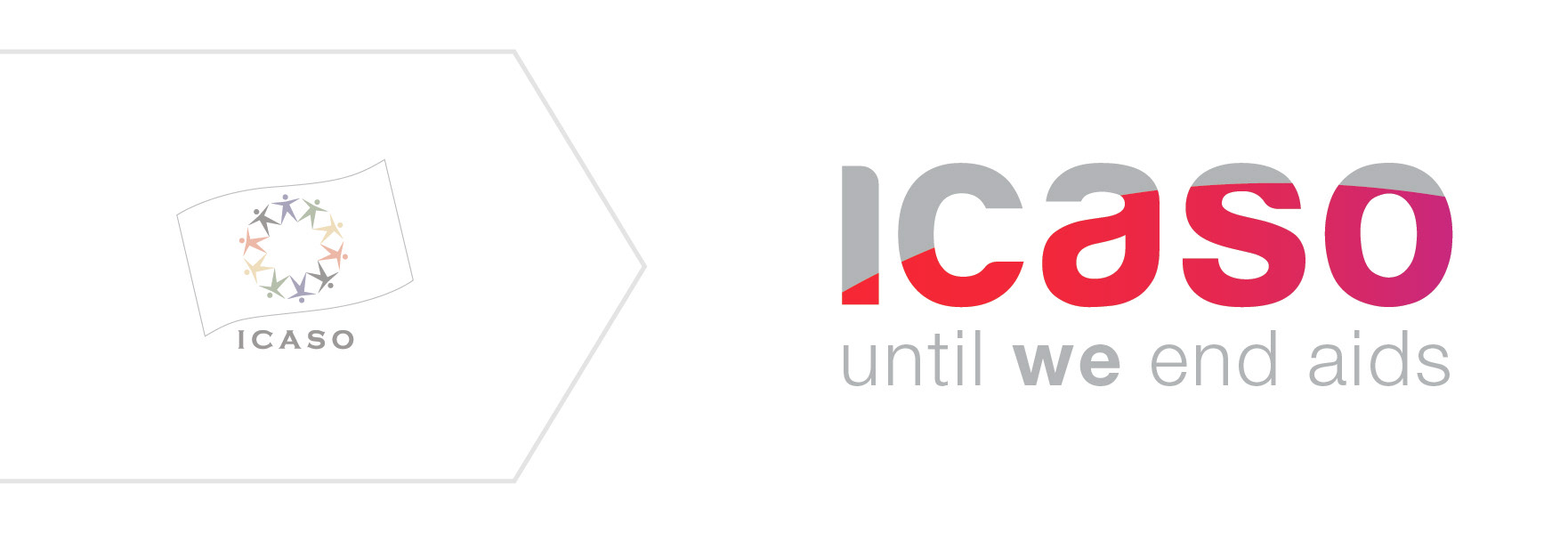
ICASO's logo holds a trajectory: the arc of AIDS sweeping past its peak, communicates the hope that we will one day end AIDS.
As ICASO embraces the challenges of 2012 and beyond, it moves
forward with a new structure and a new outlook. It also makes a bold
step forward with a fresh, forward-focused brand for the organization.
The undulating wave of the ICASO flag has shifted its trajectory, now
carrying all the energy and enthusiasm of our partnerships towards
ambitious new possibilities. ICASO’s strong presence in the evolving
landscape of the AIDS response will rally together outcome-based
coalitions of community-based advocates.
We’re investing new energy in ICASO. Merging together a vibrant
red with a bold fuchsia, the logo’s embedded arc suggests both a
global scope of partnership, as well as the forward momentum of
transformation and leadership. The edgy curves of the type point to a
contemporary and youthful organization, ready to embrace new forms
of collaboration and information sharing. Finally, ICASO emphasizes
its ongoing commitment to community empowerment, through the
bold ‘we’, in an ambitious and beautiful long term vision. Together
we celebrate our achievements as well as the potential we have in
moving forward: until we end aids.
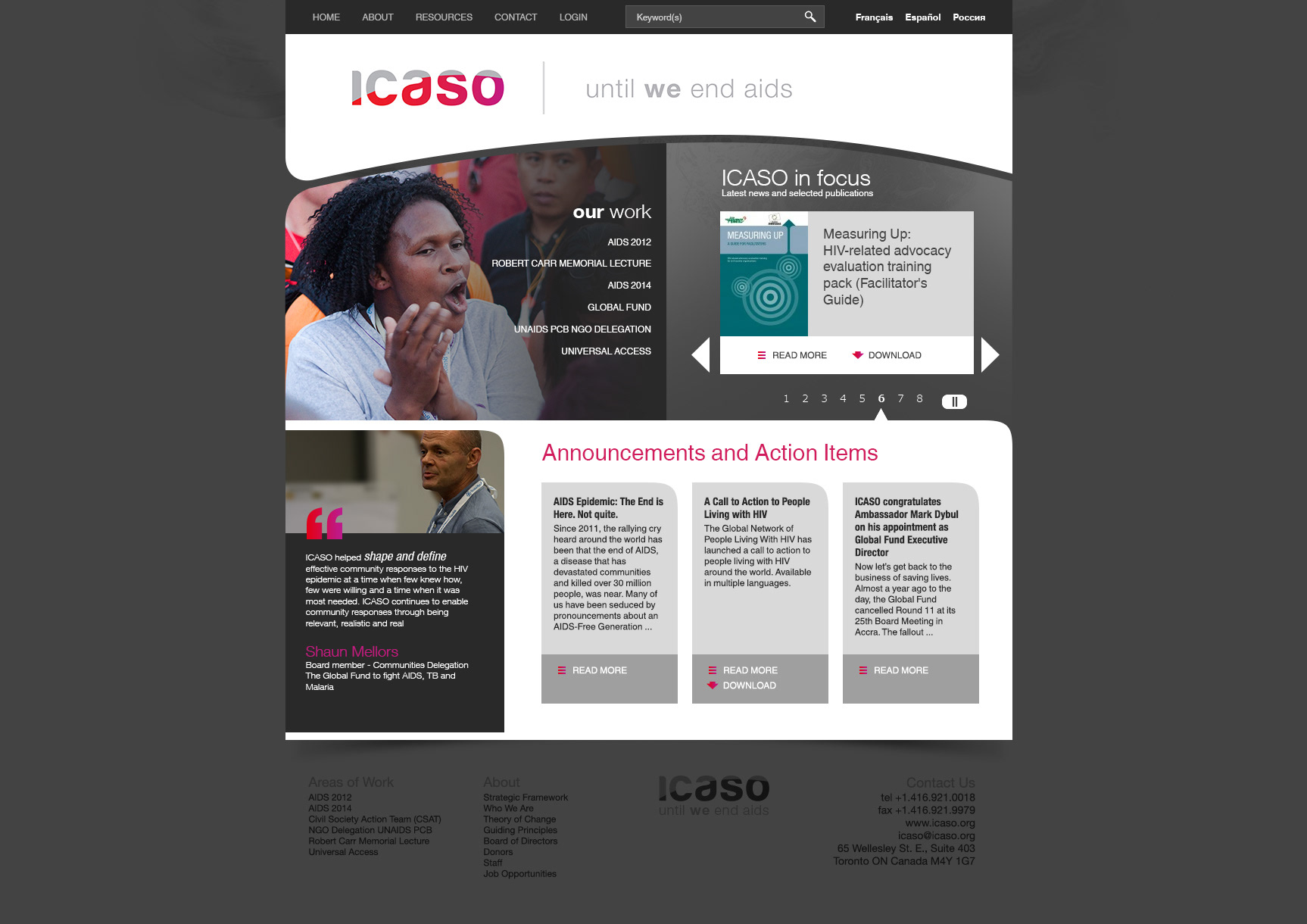
Brand implementation on ICASO's website
Paradigm shift from a secretariat to a network

ICASO logo with partner logos
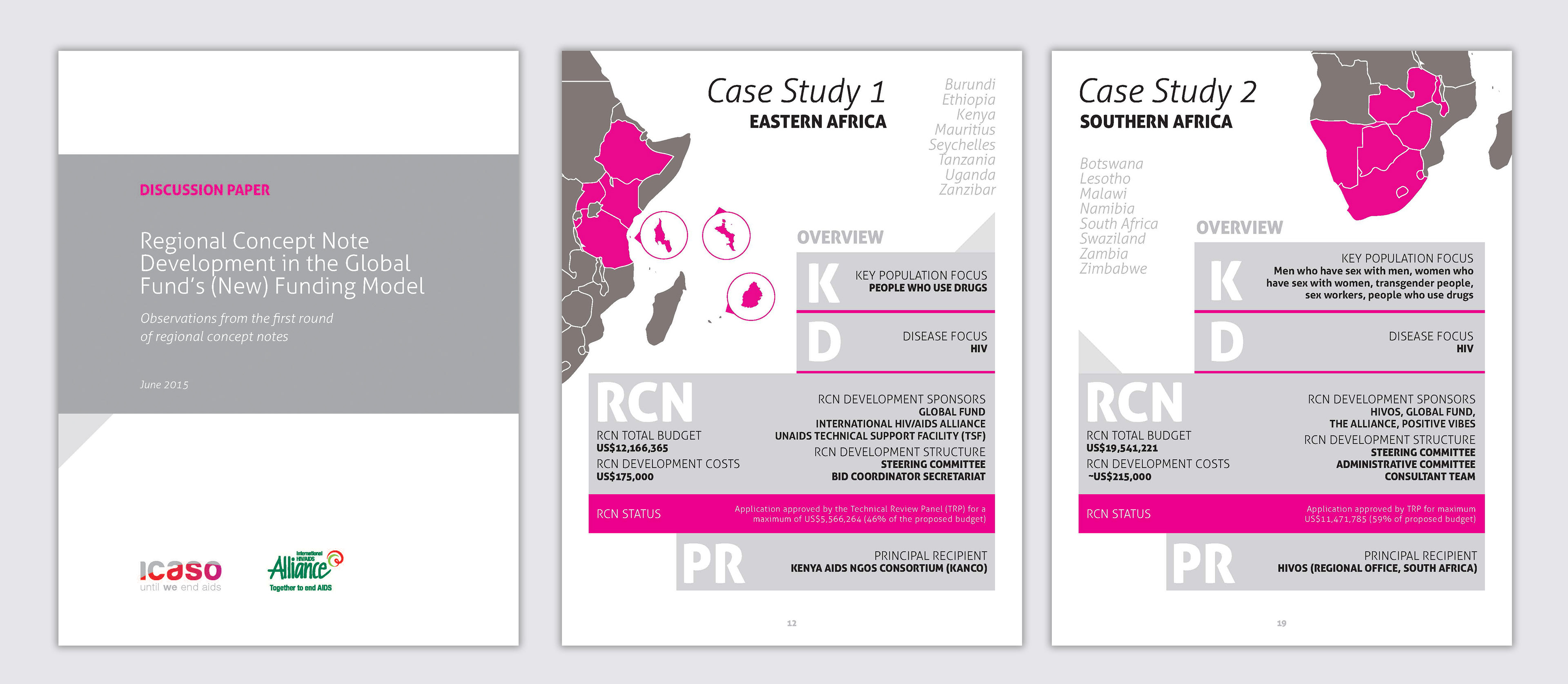
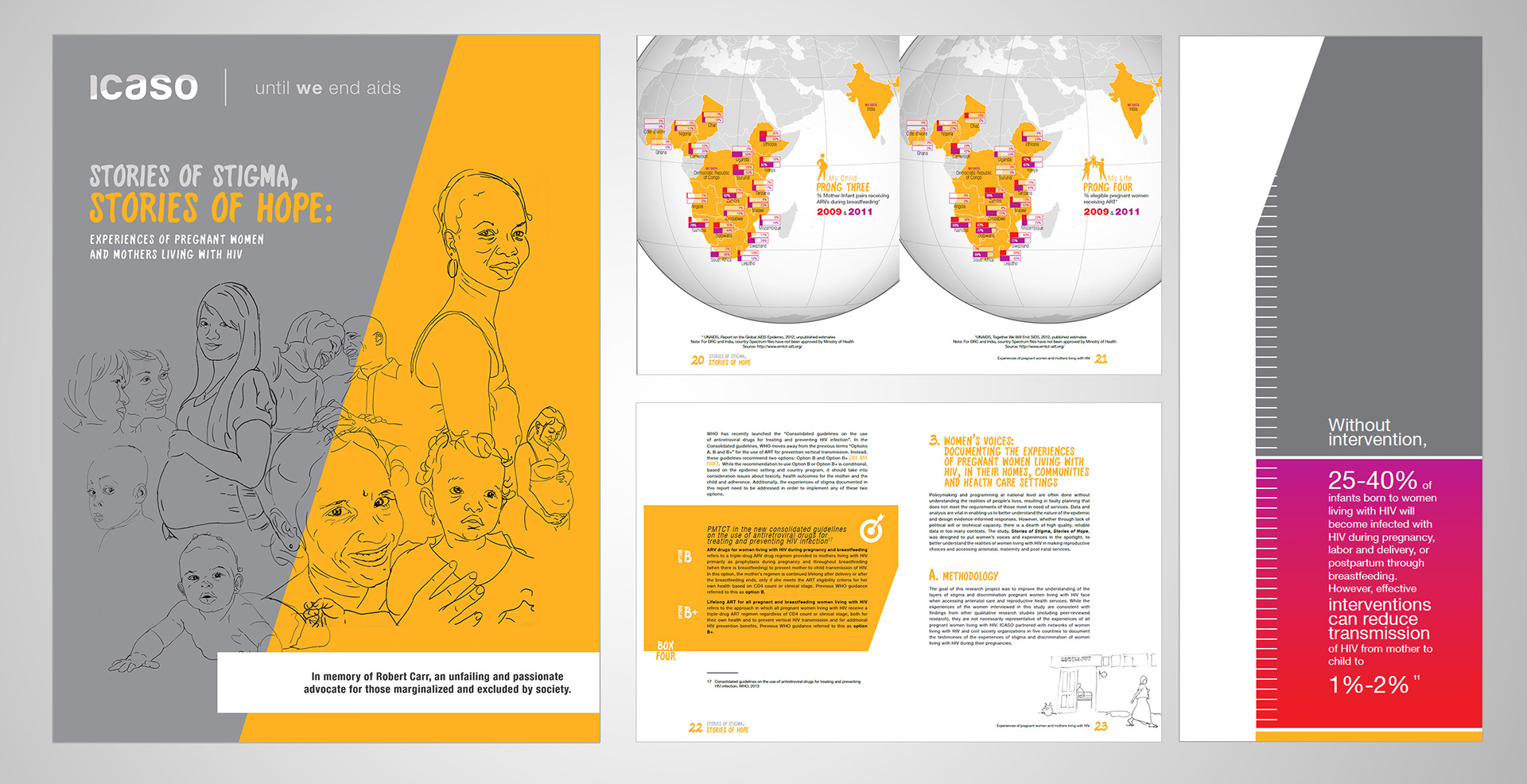
Infographics for ICASO Publication
"Stepwise" AIDS 2014 Community Guide: Logo with Conference Co-branding
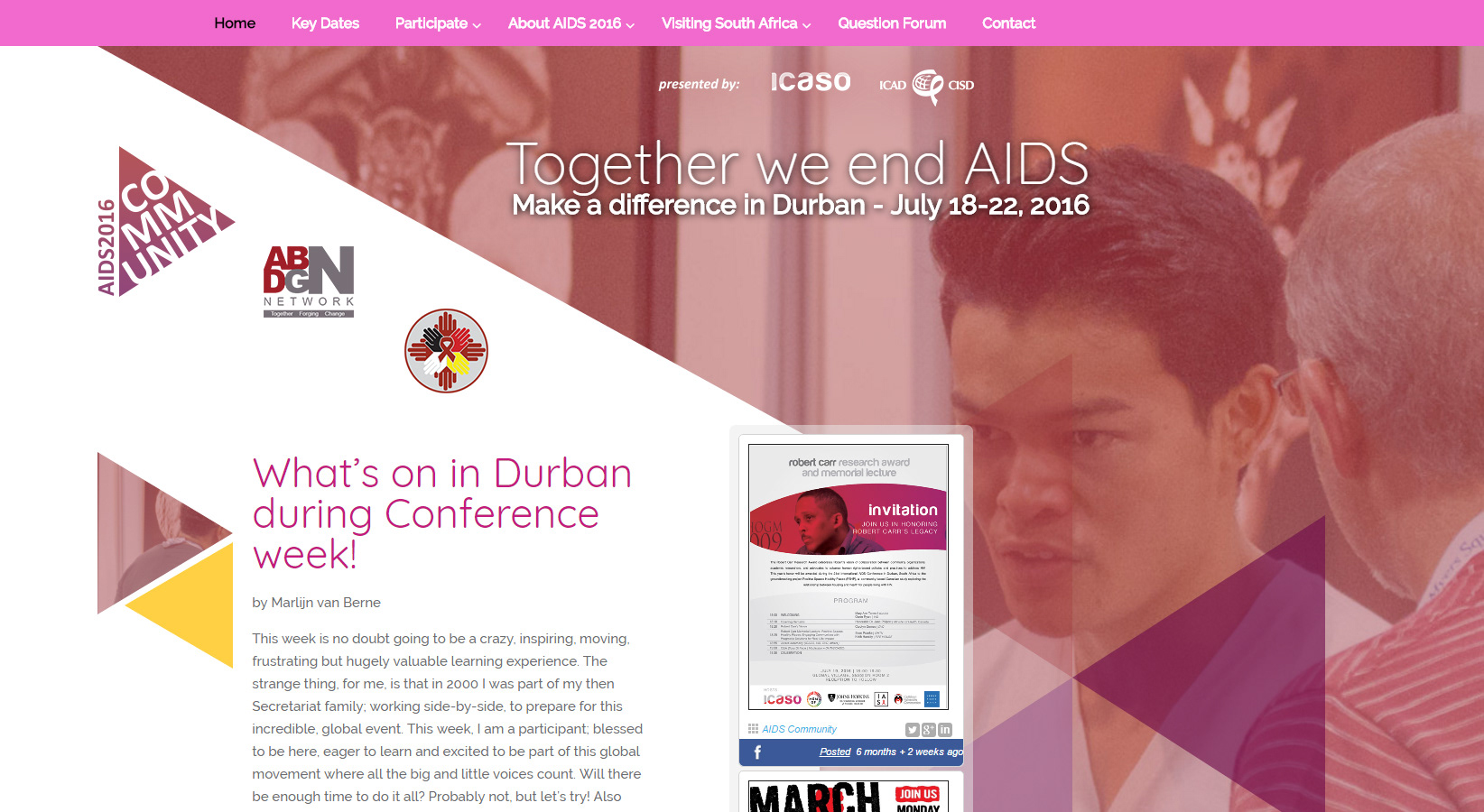
2016 AIDS conference community website

AIDS 2012 Community Guide - Website Header

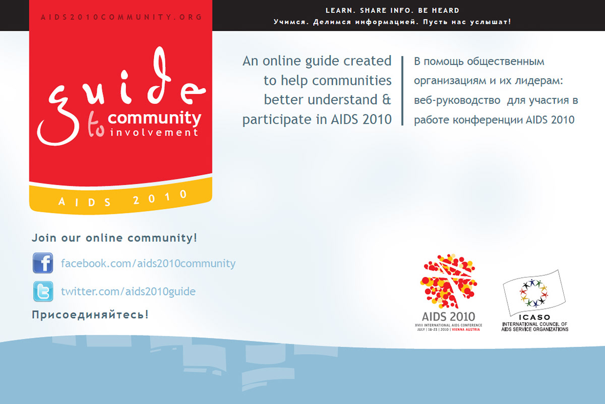
AIDS 2010 Community Guide: Promotional Materials

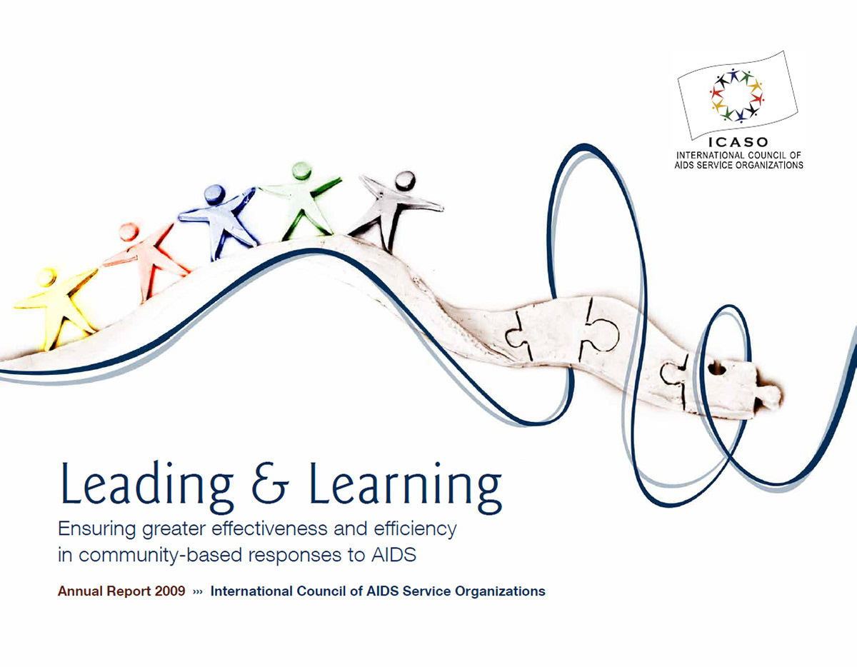
ICASO Annual Report
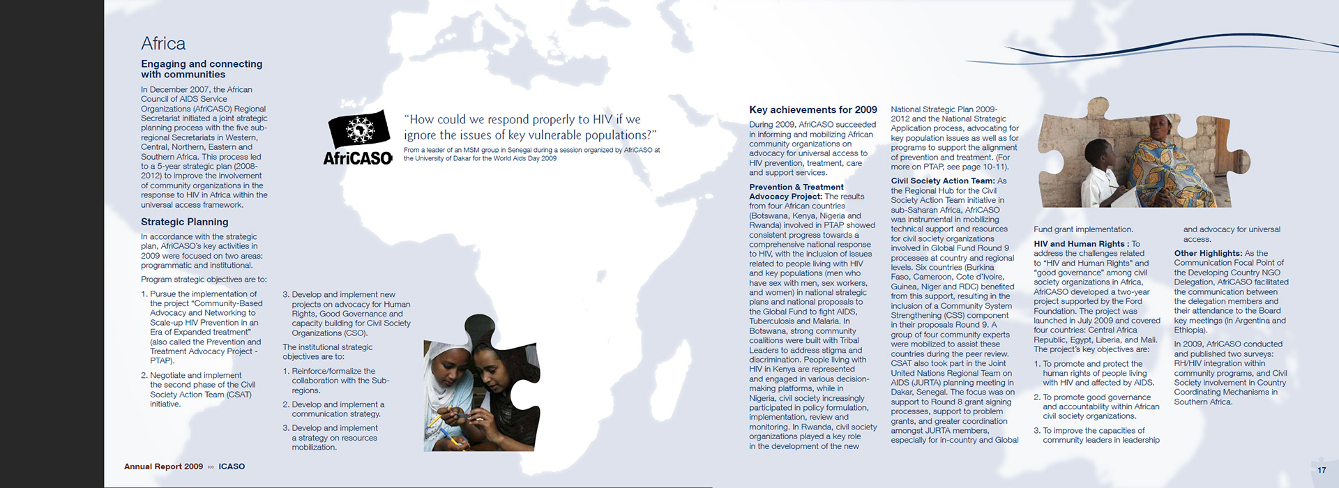
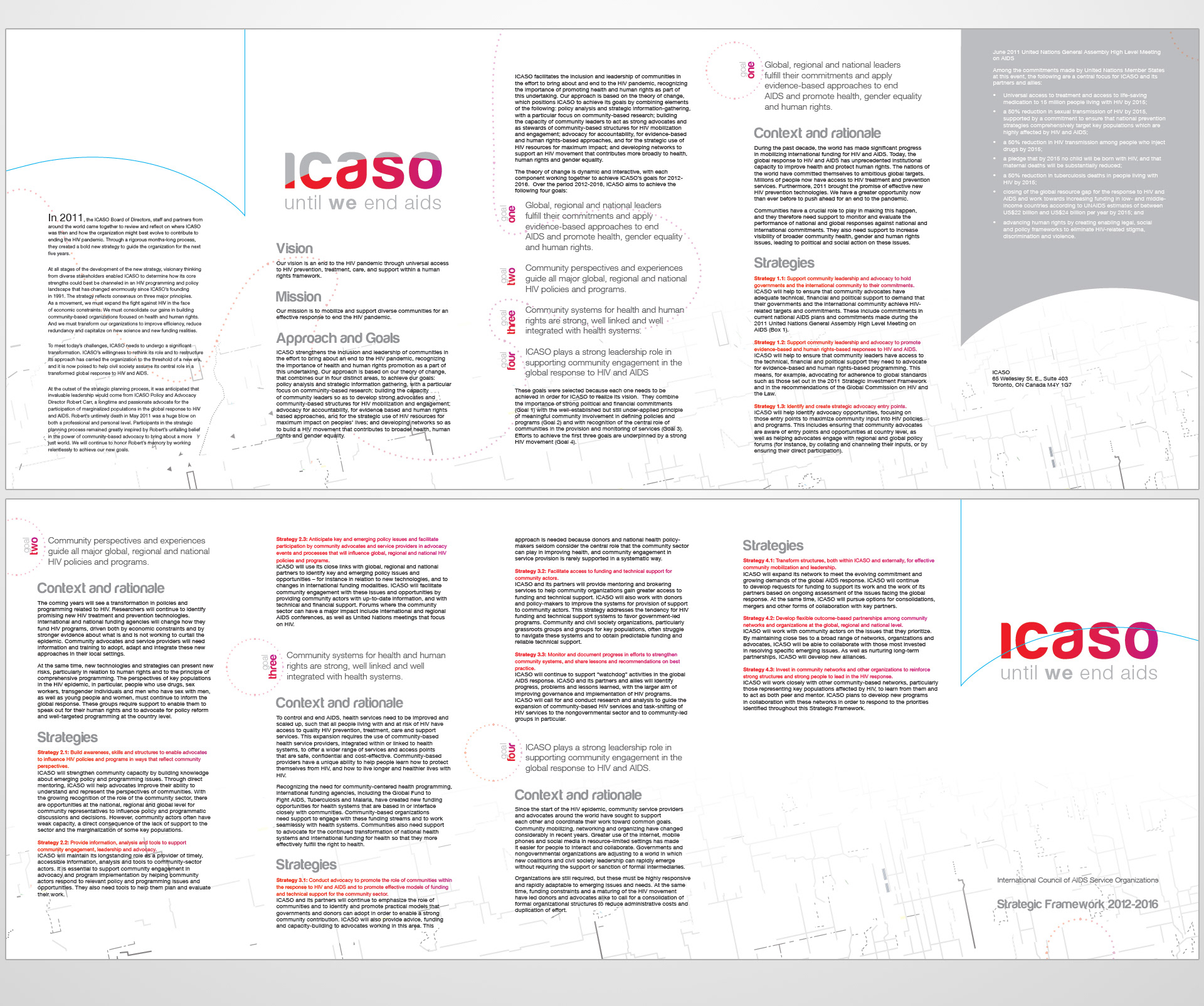
ICASO Annual Report: Spread Excerpt